
Robinhood
Empowering college-age students to confidently start their investing journey
TYPE
Personal Project
TIMELINE
November 2020
DISCIPLINE
UX Research, Product Design
TOOLS
Figma, Adobe Illustrator

Background
I’ve always been interested in building up my own financial literacy and learning how to invest. However, I was always intimidated by all the ~fancy~ finance terms and market volatility to start.
Earlier this year, I finally decided to create a Robinhood account. After realizing how little I knew, I consulted some friends who had been investing for several months only to learn that even they were still confused and unconfident in what they were doing too.
Realizing the importance of financial growth and education while still young, I decided to tackle redesigning Robinhood to make entering the world of investing less scary and perplexing.
Final Solution
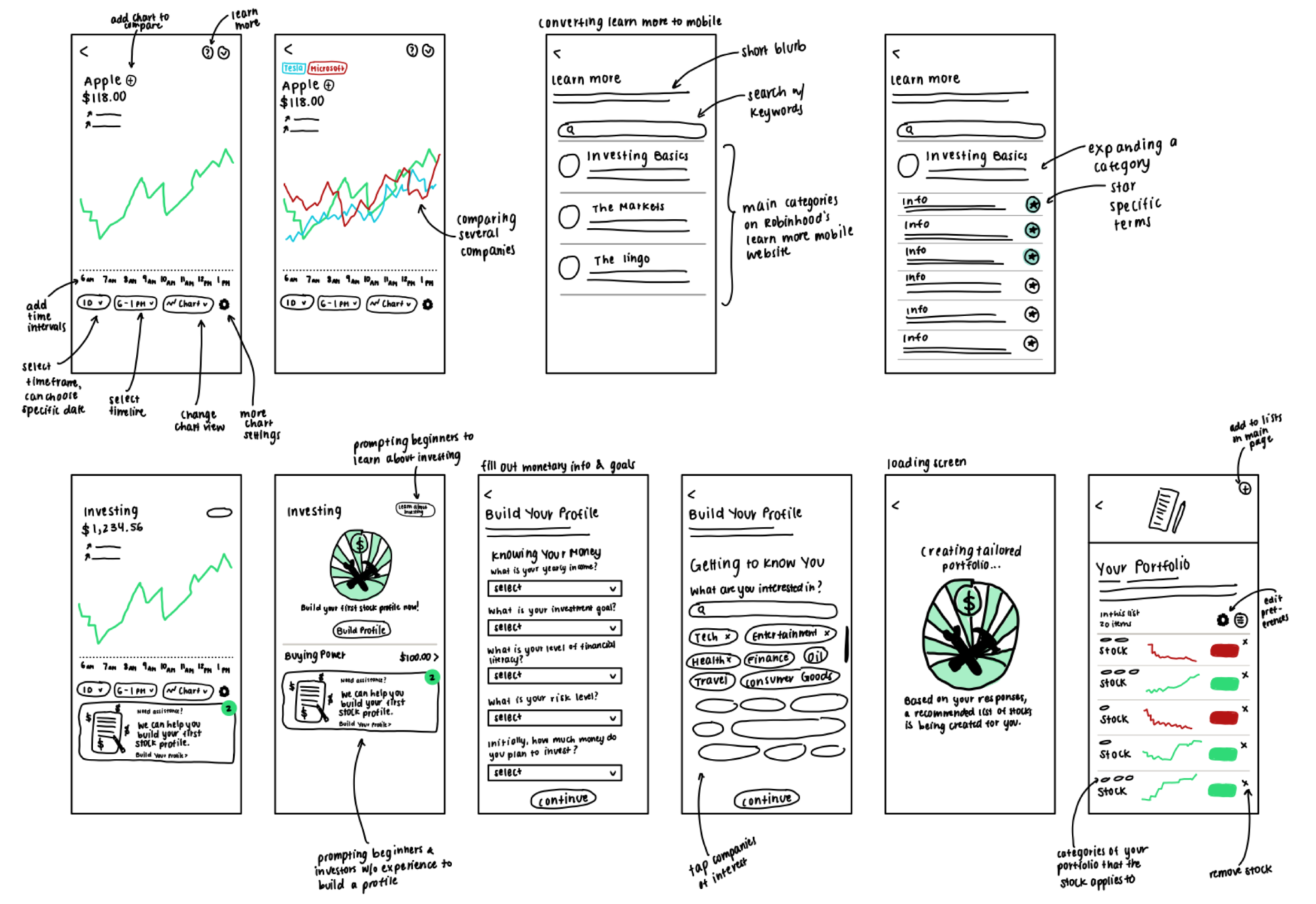
Chart Manipulation
The chart acts as the main source of information for investors in-app. By adding more options for the chart view, users are able to directly compare multiple companies so they can make the best decision for themselves.
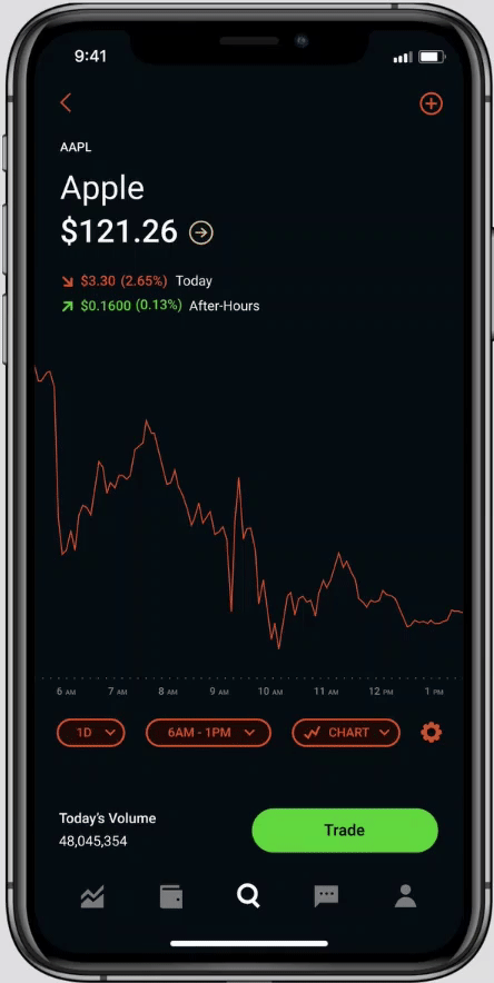
Date Range View
Currently, the options to view the different time frames are very limited. Now, investors are able to have more windows of time to view the chart in, as well as pick specific ranges within each window.
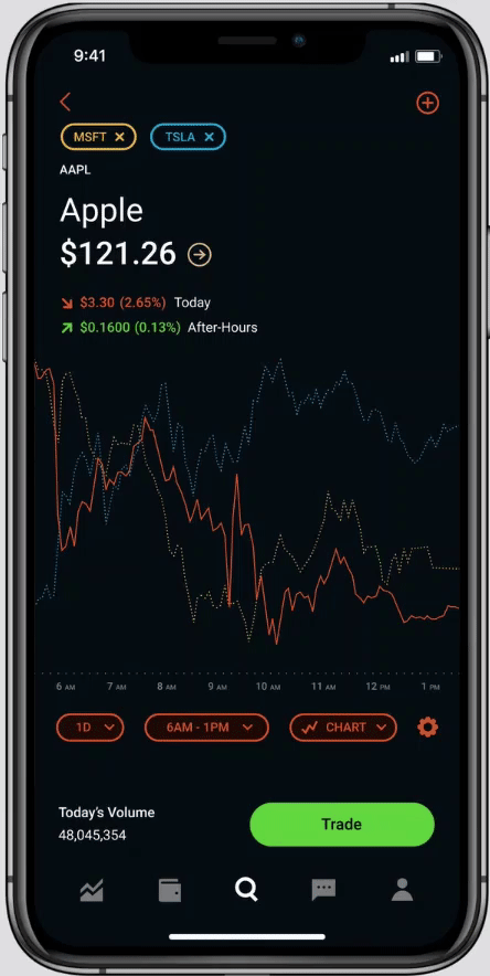
Company Comparison
Often, investors find themselves comparing multiple companies when trying to purchase a specific stock. Now, when viewing the general chart, investors are able to directly tap the “+” at the top to add multiple companies for direct comparison.
Learn More
Addressing the lack of an easily accessible and central section for in-app education.
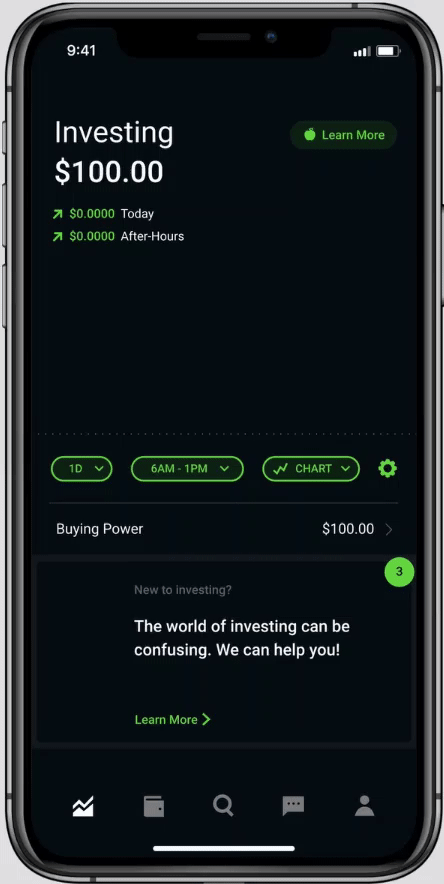
Learn More Button
To address the lack of a central and easily accessible section for users to learn more about investing, a permanent “Learn More” button exists at the top of the screen.
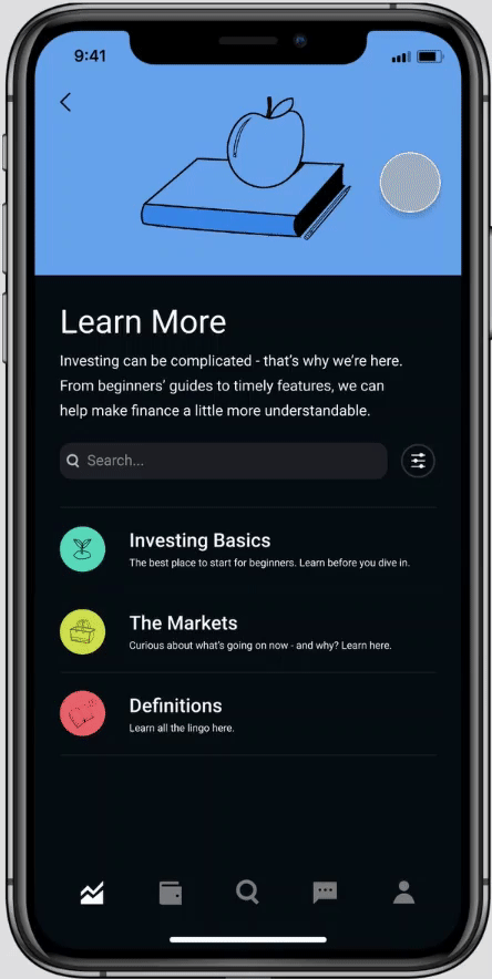
Organized “Library”
There are 3 larger categories of education, which is modeled off of the Robinhood website’s current investing learning section. Specific articles and definitions can be favorited, thus pinning them to the top for easier reference.
Personalized Portfolio
Building a personalized investment portfolio for new investors based on their financial situation and investment goals. Helps first-time investors get started on a list of options to avoid being overwhelmed.
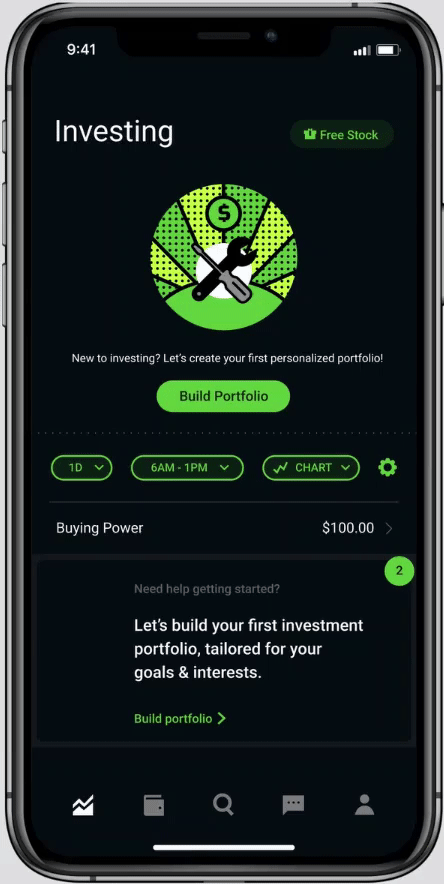
New User Initial Screen
Rather than prompting new users to jump in and invest, now there is an initial option for them to build their own tailor-made portfolio.
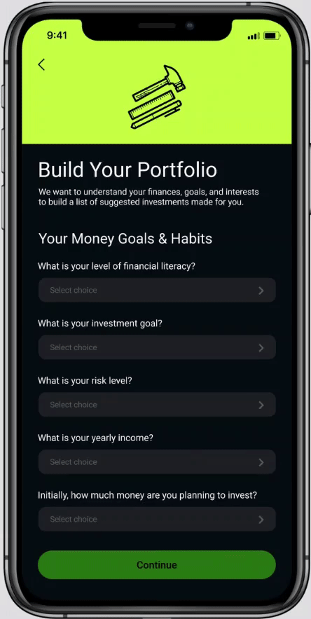
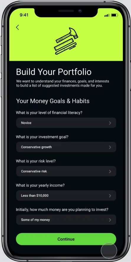
Money Goals & Habits Questionnaire
To get a good gage on the user’s experience and investing goals, there are several multiple-choice questions that can be selected. Each selection has a short blurb to contextualize the choice.
Selecting Interests
After asking about their experience and goals, the portfolio builder goes into more depth by asking the user what types of industries they’re interested in investing in.
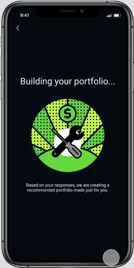
Your Portfolio
After completing the questionnaire and selecting their interests, Robinhood generates an initial tailor-made portfolio based on the user’s answers. It starts off with 20 different companies that the user is suggested to invest in, helping new investors who are unsure of where to start.
Wait a sec, how did we draw these conclusions?
Let’s see the process. 🠓
Research
To understand what pain points various users have with the current offering, I took 3 different approaches to gain information: gathering user feedback on Reddit forums and app store reviews, comparing Robinhood to different investing and stock tracking apps, and 1-on-1 interviews.
The following is an overview of my research findings.
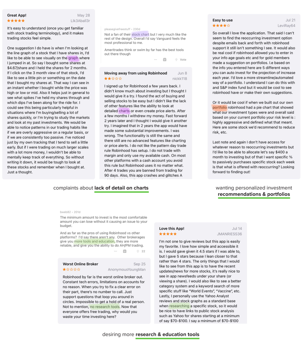
Gathering User Feedback
The main chart lacks more detail to help inform decisions and understand trends.
Most stock research and education is done outside of the app because of the lack of tools.
Desiring a more streamlined investment portfolio with suggestions.

Analyzing Similar Platforms
Yahoo Finance
Targeted towards more experienced investors. The main chart is more detailed, and has more options for viewing time ranges as well as the ability to view historical data.
Seeking Alpha
For more experienced investors. The chart has more information than Robinhood’s, complete with sections such as key data, value metrics, growth, profitability, charting, etc.
Acorns
Targeted towards beginner investors, a step towards investment education is the “Grow Your Knowledge” section that has organized topics and articles

1-on-1 Interviews
I interviewed 4 college-aged students with various levels of experience: from none at all to 1 year of investing.
A main takeaway that I found was that no matter the experience level, students are unconfident about their knowledge of investing and feel that there is much more to learn. Making decisions for what companies to invest in can be difficult and overwhelming due to the large amount of options and market volatility.
Synthesis
User Journey
Using my own personal experience and responses from my interviewees, I wrote out a user journey of a college student that is starting their investing journey via Robinhood. This type of user will be the target persona I aim to redesign for. color coded the user’s feelings throughout the process: red for frustrations, green for positive actions, and blue for neutral thoughts.

Pain Points & Needs
Through my user journey, I was able to pinpoint key pain points and needs that the specific college-aged first-time investor had. I wrote them out into notes, which helped guide the concept creation and ideation process.
Insights
Through all of the information I synthesized from research, I identified 3 key insights that I wanted to address for my redesign.
1. Users struggle with making confident decisions for stock purchases, and tend to use stock charts to help them
2. Many users seek external resources to educate and inform their investment decisions because of a lack of education on their investment app
3. Despite experience and external research, many users are unconfident in their investment knowledge
Ideation
After synthesizing my research into key insights, pain points, and needs, I was able to ideate on different ideas. I created low-fidelity sketches to imagine my concepts before creating high-fidelity prototypes for my final solution.
Re-design Opportunities
Through concept generation and ideation, I identified 3 major issues, as well as the opportunities for re-design. Listing the opportunities out helped solidify my concepts to finalize my solution and create high-fidelity prototypes for my designs.
1. Overwhelmed by amount of options to choose from
Design opportunity
Guide users on what companies to invest in, based on provided information
2. Lack of guided teaching for beginners
Design opportunity
A single “Learn More” section that is placed in an easily accessible part of the app
3. Indecision of purchasing a specific stock
Design opportunity
Adding more detailed timeline options for chart view, as well as allowing direct comparison between different companies
Reflection
Overall, this solo redesign was challenging, but also extremely fun! I learned how to keep myself accountable and create a structured design process with self-made deadlines. It was also an interesting experience trying to maintain Robinhood’s simple interface and design elements without access to mentorship and visual/brand guidelines all while keeping their mission statement in mind.
This redesign also allowed me to learn more about the complicated world of investing, and realize that I’m not the only young investor out there who is confused. Being able to achieve financial literacy is extremely important, and a goal that everyone should work towards. Robinhood overall is a great platform to begin investing because of their mission of making investment accessible to everyone. Hopefully, I am able to one day receive feedback on my designs to see if they are feasible and align with their business strategy!