
Shield AI
Building a design system from the ground up
ROLE
Founding product designer
TIMELINE
2021-present
PROJECT TYPE
Design Systems
TOOLS
Figma

Understanding the Problem
The current handoff process was inconsistent between our development teams.
Since our focus was initially on mobile products, the mobile development team was being supported every step of the way, and each feature required many back-and-forth meetings.
On the other hand, support for the web team was placed on the back burner, leading them to build our internal tools by sourcing other design systems. This handoff process was not sustainable as Shield was scaling up and now expanding beyond a mobile focus for our customer-facing products.
Shield was now starting work on a new customer-facing product: a web-application to pilot a larger AI-powered robot, V-BAT. We needed to unify all our common UX patterns and behaviors used for mobile while now needing to robustly define them for web.
My role was to build the company’s first design system to support and maintain our complex cross-platform products.
A large task was ahead of me, and it was important to tackle this by first conducting the proper research to understand how to define our products to this scale.

Components not unified
Icons inconsistent in size, color, style
When I joined Shield in the summer of 2021, it was going through many changes: doubling in size by the end of the year, acquiring 2 companies, and expanding its scope.
Working without an established design system was starting to become a roadblock. Supporting 3 cross-platform products, our process of building everything from scratch was leading to more and more design inconsistencies, inefficient handoffs, and makeshift design systems.
Incomplete makeshift design systems
Research & Understanding
What does a good design system look like?
To understand what a design system that serves Shield looks like was to first understand what a functional cross-platform design system looks like.
I looked into industry-leading design systems like Material and Carbon to see how they solve the problem of cross-platform design and efficient handoff. This helped me learn what were the common design patterns, guidelines, and workflows important for any product.
But there was one thing to keep in mind: our products were unique from companies with industry-leading design systems.
It’s important to remember that Shield products are not SaaS-based; they are used to control AI-powered robots.
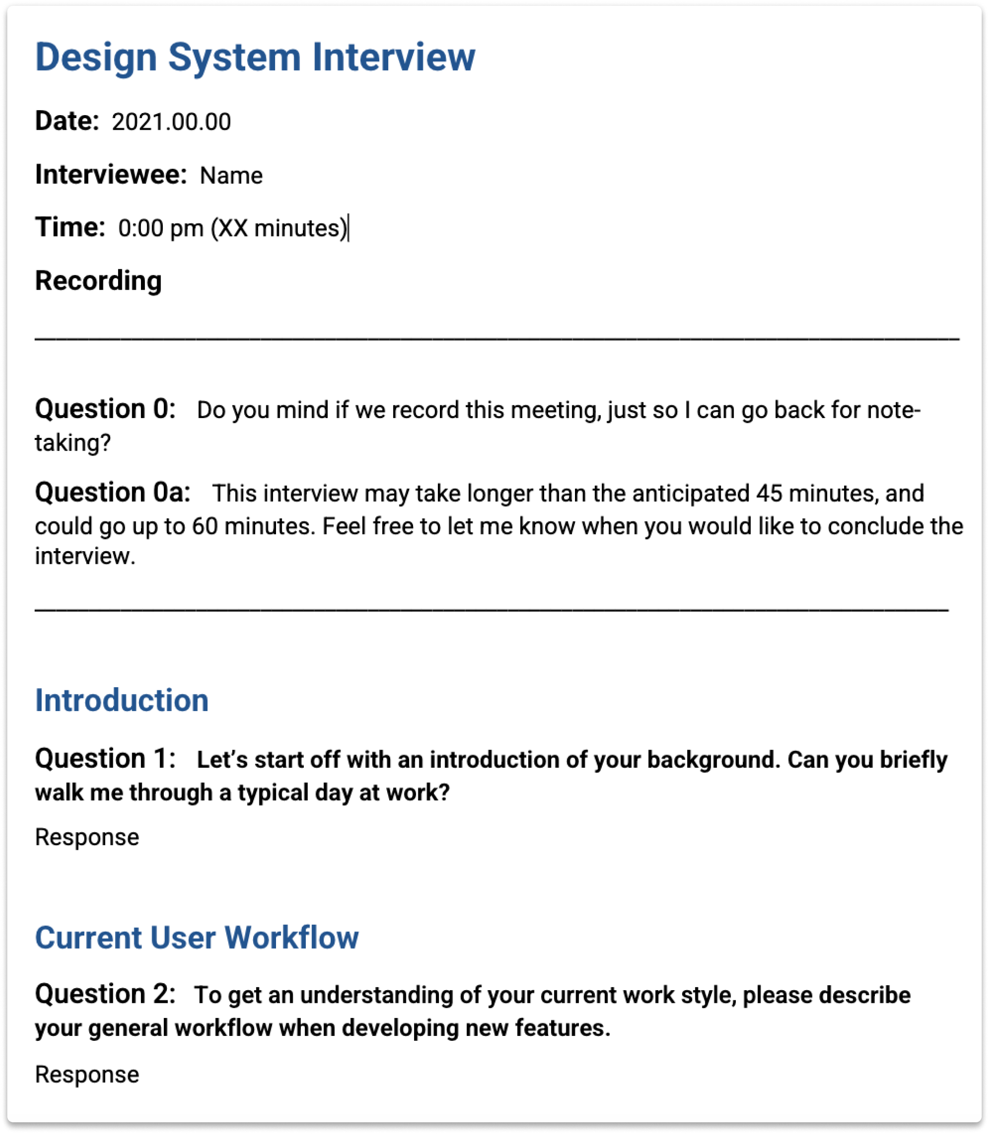
My next goal for understanding was to get more specific. I decided to talk to the stakeholders of our design system to learn about their specific motivations, pain points, and needs.
Talking to our internal stakeholders
A goal I had for the design system was to make sure both design and engineering teams could easily leverage it as our company and products continued to scale.
I conducted individual interviews with design, web, and mobile teams to learn about their current workflows for design/development and cross-functional handoff. My underlying goal for these conversations was to learn what specific needs our team members at Shield had.
1
Creating the Initial Structure
Understanding the design and engineering workflows of our products helped me identify needs and problems that the design system needed to address.
I ensured that the design system would address 3 needs that would serve Shield in the stage that it was at:
Unification across platforms
2
Scalability for all use cases
3
Scalability for our growing design & engineering teams
Keeping these needs in mind, I began to map out a structure of design foundations and components, from simple to most complex. Now I was able to start building our design system.
I wasn’t going to be starting from scratch, though.
I pulled from the resources we already had, like styles and components that already defined our products.
All the makeshift “design systems” for each product, old and unorganized design files, and Storybook were resources used to create an established design system that was unified, scalable, and collaborative.
This brought us to the SAI Design System.
The Design Ecosystem
1. The SAI Design System
The main source of truth for all our products is the SAI Design System. It acts as the global system that contains the design foundations and guidelines to create a product that looks and feels like it was built by Shield.

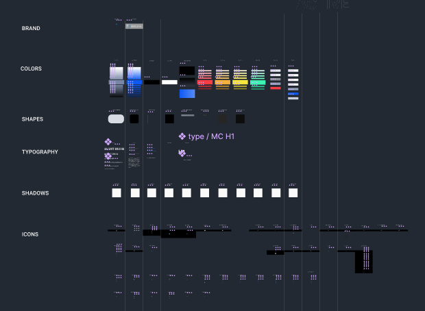
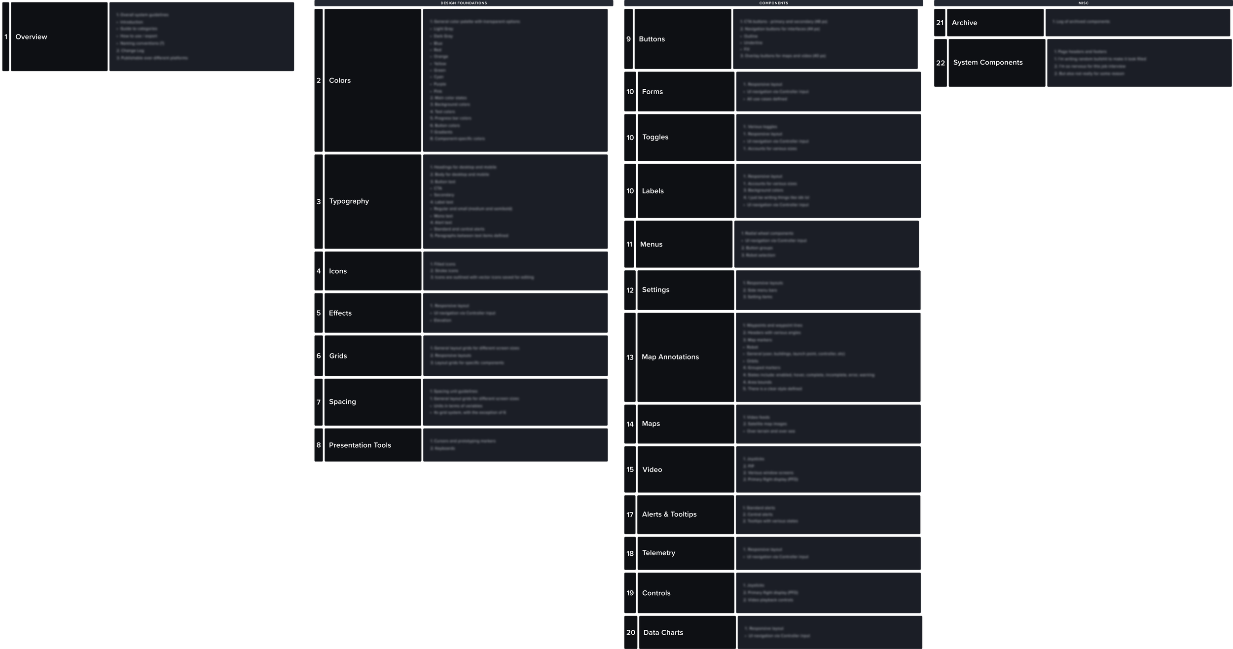
Design Foundations
At the core, are the design foundations. This is where the guidelines for colors, typography, icons, spacing, shapes, effects, grids and layouts exist. These are the building blocks of what defines a product at Shield.
Certain foundations need to solve many different problems. Piloting an AI-powered robot is a complex, multi-layered challenge. For example, it relies heavily on visual cues and colors to represent various states and interactions, so it was important to get Colors right.
Let’s take a look at colors.
A lot of industry standard aviation practices influence how we view color at Shield. For example, the industry standard theme for all UIs is dark mode. There are specific color shades that represent states like error, caution, and success. These industry standard practices do not act as a barrier to our creativity and design thinking at Shield, however, as we are able to incorporate and use them as guidelines.
At Shield, we approach color in a more visual way without fixing what’s not broken. To do that, there is a system in place for application.
The first layer is Primitive Colors.
This is the general color palette, without any specific use cases defined. These colors serve as the base for semantic colors that do define specific use cases.
The next layer is Semantic Colors.
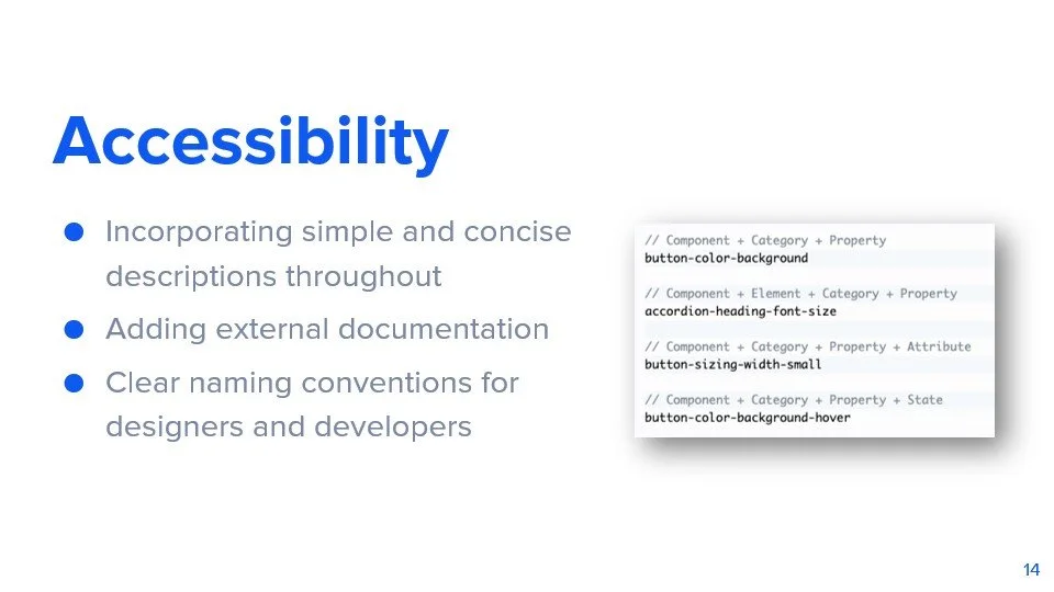
Semantic colors draw from Primitives to assign meaning and usage to colors in specific situations. Using variables and design tokens, colors are made easy for designers and developers to reference.
Components
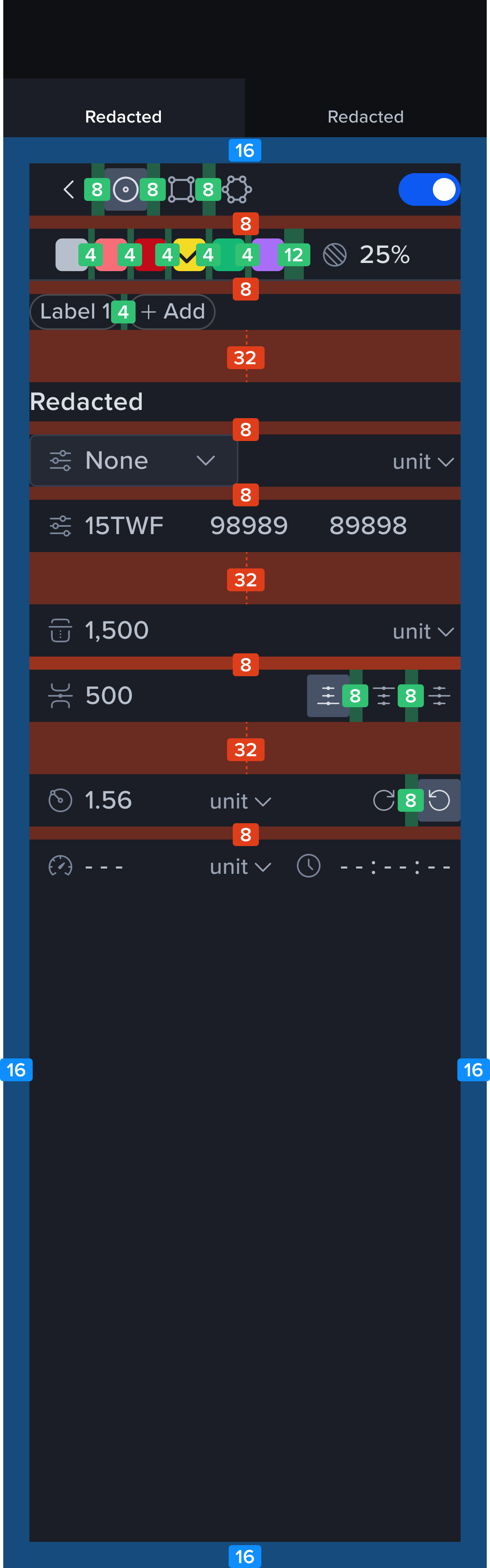
Shield uses a lot of components not normally found in other design systems. Components such as telemetry, map annotations, maps, video, picture-in-picture are accounted for, along with all the standard components found in all software apps.
Components are also built for cross-platform use. To unify components, there are variants that account for sizing, density, and appropriate design foundations.
Let’s take a look at some buttons
The “Primary” button acts as the main call-to-action button. To account for usage between mobile and web, there are variants for size. The different variants use the appropriate type and spacing guidelines, which define clear use between platforms.

2. Local Design Systems
For each specific product, there exists a local design system. This allows each product to have its own tailored design elements that don’t necessarily belong in the global system.
In a local design system, the Shield Design System acts as the base to build out the foundation of the application. When there is a component that is only used in that product, it is defined and exists only in the local system.
A local system also directly promotes the growth and expansion of the global system. Building new components that are specific to a product is now easier by referencing guidelines and design principles already established. If that new element or component is beneficial to use in future products, then it is added to the global system.
Let’s take a look at an inspector panel
For example, the one of our products needs a special inspector panel designed. There are three aspects to create this specific feature:

When the inspector was finalized and handed off, my team member working on it realized a component like the multi-field input was a useful component to have in the global system. He submitted the component for evaluation and approval into the SAI Design System, where it was accepted and published as a new official global component.
The growth of our design system also continues through our local systems, creating a scalable, mutually-beneficial design ecosystem.
3. The Overall Ecosystem
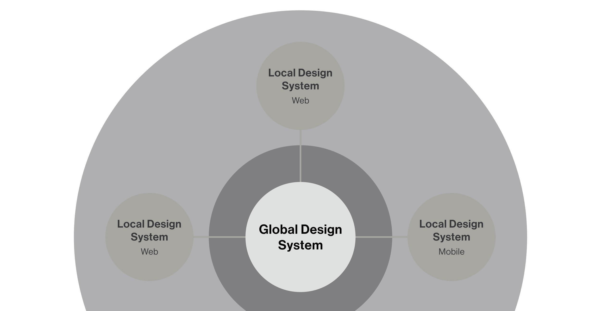
Overall, the Shield Design System is the foundation that represents the core of all Shield products.
Each local design system is built off of the foundation, representing a specific product. Each component contributes to the entire ecosystem of design, as each local system encourages growth and builds off of each other.
With a clearly defined system and defined tokens, the design system also acts as a resource for easy cross-functional collaboration during handoff.
This overall workflow and structure encourages anyone at Shield to jump into any part of the ecosystem and leverage exactly what they need from it.
1
General components like inputs, dropdowns, and buttons are taken from the global components that were already built out
2
Design basics such as spacing, layout, and type are referenced from the guidelines defined in the global system
3
Components that don’t yet exist like the multi-field input or color picker are built out using global components and established UX patterns
The Impact of the System
Today, the SAI Design System is well-integrated into the workflows of all cross-functional teams at Shield.
Components and styles are used in 100% of our design files, and the system continues to grow as our local design systems encourage new additions and refinements.
It has managed to support our products through the many challenges and uncertainties faced. Situations we’ve faced such as the flip flop between what screen resolution a product will be running on or needing to adapt a product to tablet can be easily navigated.
Cycle times for individual features have improved by around 100 hours compared to before the design system.
Design sprints move smoother now that each feature doesn’t need to be build from the ground up. What would take 3-4 design sprints for a feature can now take 1-2. Handoff has become less tedious, and small meetings to align on simple things such as aligning on components and design language are a thing of the past.
My role as the design system lead is important as I ensure updates are regularly pushed out, make sure the system maintains scalability, and work with developers to bridge gaps between cross-functional teams.
Some Final Thoughts…
The design system started off as a “we’ll cross that bridge when we get to it” project before it quickly became necessary to keep up with Shield as it evolved and grew. We needed a design system tailored to serve the needs of a hardware-based, AI-powered product.
I learned that in order to build a successful design system, it means you must be able to fully understand the company’s needs, characteristics, and goals.
For each challenge that Shield faced meant there was a specific approach for the design system to address and solve them. The brand that Shield had already created prior to creating the design system was present, and defining a clear visual language helped to translate it cohesively across our products. Creating a robust and scalable design system that can be used cross-functionally allows Shield to better collaborate and work towards building our complex products.
The SAI Design System continues to grow, and with the groundwork laid out, the systems will continue to evolve alongside Shield.